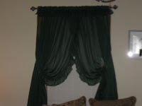
about the kitchen window treatment: should i take down the shorter one and put the longer one up? hhhhmmmm. i do like natural light coming in the kitchen and it's pretty much blocked out with both "curtain pieces" up.
and if you go to the previous post check out the picture w/ the silver clock. does this need something. paint around the red? shelf? what?
my living room before.......
notice the colors in my couch. im going to go with two to redo my living room/alcove: chocolate brown and orange-burnt orange sort of.
new window treatments: chocolate brown
wall w/ t.v.: chocolate brown
alcove: orange/burnt
pillows: orange/bunt
my parents are coming in two weeks and tanya paul and i are having a "mini progressive dinner" for michawn and family before they go back to brasil and i want the above improvements done by that time ....so i got lots to do:)
ready. set. go!
Friday, January 30, 2009
idea help needed and before pictures of my living room
Posted by Steph at 5:58 AM
Subscribe to:
Post Comments (Atom)


1 comments:
I like both curtains. They aren't that thick so you will still get some sun.
You need something with black in it in the red part above the oven. Shelves would work....with cute things that match sitting on them.
Don't do a picture...try a different clock, something wrought iron, etc....be creative. Just go find something that you LOVE and put it up there. Don't put it up if you don't love it. Look around your house...do you already have something? Could you repurpose something?
It all looks great! Can't wait to see the chocolate brown and orange!
the word verification is "twarting" haahahahahahaha
Post a Comment